
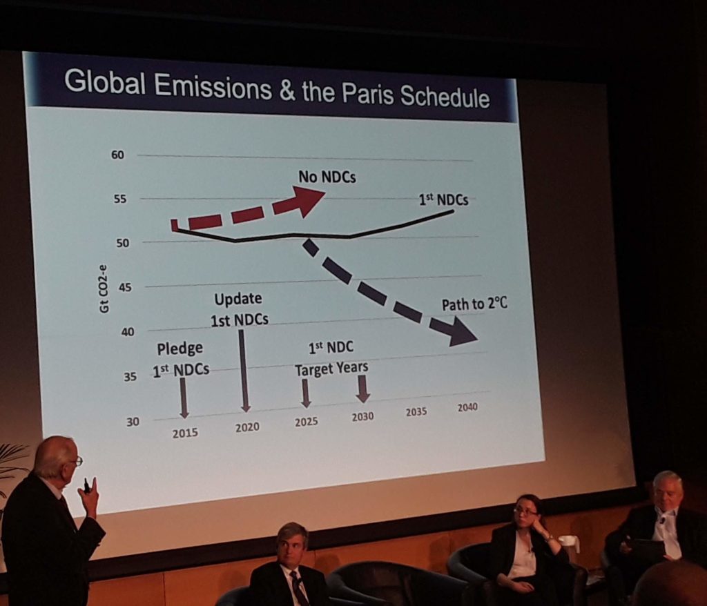
These, I think, are the three most critical graphics from Tuesday’s program on climate policy, the most recent of MIT’s climate change symposia.
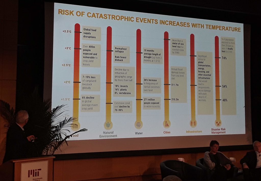
This first graphic benchmarks the economic and civil consequences risked as a function of each degree of projected temperature change. (Note that a 1.5 degree increase is already baked in as a result of carbon already emitted.)
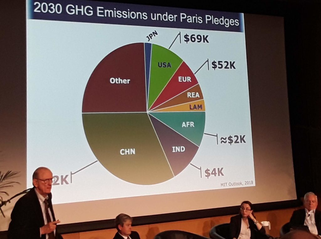
This third graphic is a pie chart showing the global geographic distribution of emissions correlated to per capita GDP indicating where urgent leadership must arise.
Full video here: https://www.youtube.com/playlist?list=PL1K22DNPRrIgyrAzGTk1IRZrKrkBsHJcy